Yell Yea
The Yell Yea mobile app is a alarm app that allows users to easily easily set custom sounds as alarm notifications. The Yell Yea app allows users to record alarm sounds and eaily send them to friends and other users to set as alarm notifications
My Role: UX Research | UX Design | UI Design

Overview
Role: UX, Visual Design, Branding & Identity
Tools: Figma, Google+
Date: Spring 2022
Scope: Recoring Screen, Recordings Library, User Sending Screen
Skills: Competitive Analysis, ideation, user stories and flows, creating personas, survey design, conducting user interviews and observations, sketching, wireframing, prototyping, user testing & analysis
The Challenge
The default alarm apps on phones won’t let you set recordings as alarm sounds easily.
The Solution
building an app that will allow people to set recordings their friends send them of screams/yells as alarm sounds, The scope of this project will be to design the scream used to record and send screams.
A new way of waking up.
The Audience
The audience is regular bus riders who use the bus to commute on a daily basis. The typical user has a regular schedule and rarely deviates from it.
Process

Discover
Difine
Develop
Deliver
Solution
Discover
Client Interview
In the client interview, we discussed the primary target end user for the app which was a single, College aged male. We also spoke about the need to have a way for your friends to record the message, and then you set your alarm and it plays the voice message. As well as the “Vibe” he wanted the app to have.
Initial Findings
I did not do an initial survey to inform research. I used my findings from my client interview to influence the development of my personas, user flows, and initial design creation. I now know that an initial survey would have provided me with the necessary information to save time later in the development and design process by understanding potential users’ pain points before user testing. The iteration later in the design process would have been less labor intensive and influenced by those outside of the design process.
Competitive Analysis
I kicked off this project by researching a main competitors to understand their product’s strengths and weaknesses, as well as gain an understanding of basic user expectations. I looked at the Apple Alarms app.

Strengths: Attractive Style, build in, Easy to use
Weaknesses: Located within the Clock app (multiple steps to get to the alarms), Limited to default sounds or purchased ringtones.
Opportunity: Make the alarms the focal point of the app.
Define
Personas
Using my knowledge of the target market discussed with my client, I created two personas that represented 18-25, Man, College students.


Customer Journey Map
I then created a customer journey map for Damon to really get into his mind and understand his experience of using the app
Creating Journey Maps is always a great exercise for me because as I imagined the emotions Damen would encounter along the way, it allowed me to realize new design opportunities for later iterations of the app’s design.

User Stories
To establish features needed for the MVP of YELL YEAH, I created a list of user stories of potential tasks of new and returning users. The priority of the tasks determined whether or not they fell in line with the MVP.
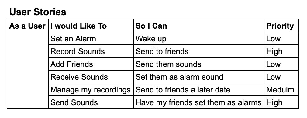
Highest Priorities:
Creating and logging into an account
Uploading current wardrobe
Inputting date information
Receiving suggested outfit
Develop
User Flows
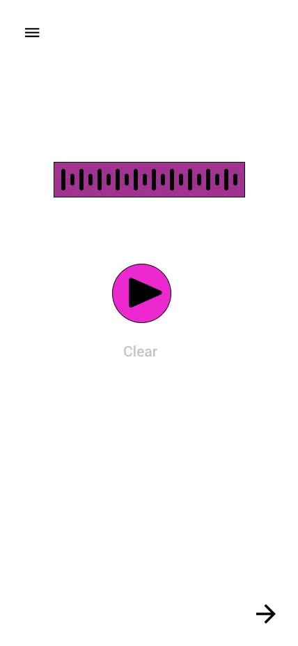
For this exercise, I thought about how the user would need to flow through an app to get the desired outcome of Recording and sending Audio Recordings, based on user stories.

Sketches
After creating user stories, and user flows, i started skteching, I used the four-step sketching process that helped me design and quickly work through effective solutions.


I then passed my initial sketches off for peer review and critiques. And this actually shifted my whole design, my original sketches had the users select the Who they were sending the recording to from the same screen that they recorded from, and some concerns were made that it was too cluttered.
Wireframes
Using the user flow and my competitive sketches, I created low fidelity wireframes. After a sticky decision critique with another stakeholder, I edited my ideas and created the wireframes in Figma. The wireframes were used as the blueprint to create the clickable prototype in Figma to user test.

Branding & Identity

Clients Logo Colors
Branding Story
During my Interveiws with my client, they had mentioned they wanted to incorpate the colors the logo for they’re online gaming channel into the apps colors.
This actually raised some issues during this faze of the project because the logo’s colors didnt have very much contrast and would create usuabilty issues for anyone with color deficiencies.
Lucky after using a color blind filter and some convincing, I was able to persuade the client to go with a more accessible color plallet.

Deliver
High Fidelity Prototype
I applied the branding to the wireframes to create a clickable, high fidelity prototype.


User Survey
I developed a screener survey for potential users to fill out questions to lead to an eventual interview using my network of friends and peers via Slack. These questions would help filter the surveyees for me to select a few to interview and record for user feedback.
User Testing

I then conducted my user testing, I tested it with 7 users. Out of the 7 users, 5 of the users mentioned that they were not sure if the recordings had been sent. And 4 oud the User said they wanted to be able to more easily navigate from page to page.
"I’d like it to tell me that the recording set."
- Participant 1
"I would it to show me whos selected better."
- Participant 2
“Can I navigate to see what friends I can send a recording first?”
- Participant 3
Solution
Final Prototype
Since a primary pain pointwas that there was no success page, I added in confirmation after the recording was sent, and 4/7 of participants wanted to navigate more freely through the app. Sol created a navigation menu

Once I was finished with the final design, I retested with new participants within my network. The design problems from the first round of testing were no longer pain points to these new users
Reflection
Yell Yea was a project that taught me the importance of rapid iteration and testing to create an MVP for the client, but most importantly a usable product for the end user. Knowing simplicity, engagement, and ease of navigation were most important in creating a usable product for end users helped me create an MVP for my client. Upon reflection, I now know how important it is to conduct an initial survey for research of potential user pain points before creation. However, testing led to quick iteration and creative problem solving through pain points for a desired end result for all stakeholders. The iteration within this project allowed me to be more creative in my problem solving skills and simple in my design for mobile products.