Metro Meter
The Metro Meter mobile app is a live bus tracking app that allows commuters to easily identify what bus is coming and when it is arriving in the Midsized Metropolitan City. The Metro Meter app prioritizes clearly displaying key information that a rider needs in order to experience a seamless and efficient trip.
My Role: UX Research | UX Design | UI Design

Overview
The Challenge
The current bus schedule is listed on the city’s website and posted at each bus stop, but this information quickly becomes inaccurate when traffic, maintenance issues, and assisting handicap passengers are taken into account.
Additionally, ever since the city added new bus routes, there has been an increase in congestion, confusion, and frustration for commuters, especially at certain stops where up to seven bus routes converge.
The Solution
Metro Meter delivers information clearly and efficiently, upfront. The app uses location tracking to display the most up-to-date information about a rider’s bus route within Tree steps. Metro Meter provides peace of mind by allowing riders to know exactly how far their bus is as they begin their commute.
Riders just want to know which bus is theirs and when it is coming.
The Audience
The audience is regular bus riders who use the bus to commute on a daily basis. The typical user has a regular schedule and rarely deviates from it.
Process

Research
Strategy
Information Architecture
Branding & Identity
Visual Design
Research
Client Goals & Desired Outcome
To serve thousands of commuters, the client wanted to create a live tracking mobile app that would address these challenges. Specifically, the goals of this project were to:
Ensure that any rider can tell when each of the buses arrives at the Washington & State bus stop
Ensure that all riders can tell how much time they have to get to the Washington & State bus stop before the bus they need arrives at that stop
Allow riders to select one of seven bus lines to see a list of its future arrival times at the Washington & State bus stop
User Research
I laid the foundations for my design by first conducting user research in the format of quantitative and qualitative research. I sourced participants from multiple platforms, forums, and my personal network.
Quantitative Research
I designed an online Google form in order to deploy a survey to a large number of people and achieve statistical significance with my data. This allowed me to understand user behaviors and thoughts at scale.
62 Participants
Survey deployed via Google form deployed to multiple platforms, forums, and personal network
Qualitative Research
After the survey, I wanted an in-depth understanding of a bus rider’s emotions, desires, and expectations throughout their experience. The 1-1 interviews allowed me to ask specific follow up questions designed understand their behavior and experience of transit or navigation apps, what they liked about them, what they disliked, and how they used them.
3 participants selected from the existing surveyed pool that fit the criteria:
Regular bus riders
Commute to work
Interviews conducted in person
Lesson Learned
I realized in my quantitative research, that I made my questions a bit too wide in scope and focused too much on the user’s overall bus commuting experience rather than their experience using apps. I adjusted my questions for my 1-1 interviews to focus more specifically on a user’s behaviors, thoughts, and feelings about the apps they use on their commutes.
User Research Results
35%
Of these bus riders have a “somewhat regular” weekly schedule Monday through Friday
40%
Take the bus to commute to work, school, or training
40%
Of these bus riders have a “very consistent” weekly schedule Monday through Friday
50%
Use the bus “everyday” or “often”
75%
Are not intimidated when taking new bus routes
85%
Use a weather app and/or social media app on a daily basis
My qualitative research revealed deeper and more specific insights on a bus rider’s commuting experience and their likes, dislikes, & wishes about transit apps.
“I wish I had ETAs based on real-time traffic information.”
— Participant 1
“I wish I could have] up-to-date alerts (i.e. delays, accidents, etc.)”
— Participant
“I’d like to know why my bus running off schedule.”
— Participant 3
Key Takeaways From User Research
In conclusion, my research revealed the following insights:
#1
Knowing when the bus will be arriving is the most important thing
#2
Both early and late buses, but especially early buses, ruin an experience
#3
Users would like to know when the next bus is arriving.
#4
Users want an app that knows their usual bus routes and will show them information related to it right away
Competitive Analysis
I kicked off this project by researching three main competitors to understand their product’s strengths and weaknesses, as well as gain an understanding of basic user expectations when using transit apps. I looked at Citymapper, Google Maps, and Transit Stop.
Citymapper is an extremely robust transit app that covers anything from a bicycle to a ferry. It has an intuitive interface, especially for the amount of features it has. Its weakness is that it is overloaded for someone who is looking for one type of commute.
Google Maps provides navigation information for drivers as well as transit users. It is intuitive to use, but its weakness that it is more robust than what a bus commuter needs, burying necessary information further into the app.

Transit Stop is focused on bus and train transit, providing arrivals times and estimates. Its weakness is that the UX is not intuitive, making it difficult to learn, and ultimately creating a more frustrating experience for the user.
Strategy
Personas
Based on the data collected in my research, I created a user persona that captured consistent behaviors, goals, and needs amongst the research participants.


Customer Journey Map
I then created a customer journey map for John to really get into his mind and empathize with his experience of taking the bus everyday to and from work.
This was a great exercise because as I imagined the emotions John would encounter along the way, it allowed me to realize new design opportunities for later iterations of the app’s design (but not for the MVP) such as having a weather widget or playing music from the app.

Key Opportunities
Showing a minute by minute countdown
Send alerts when the bus is x-minutes away
Displaying the weather on the bus app home screen
Playing music from the app
Information Architecture
User Stories
To prioritize the features of the bus transit app, I created user stories based on tasks and potential motivators. After creating as many as I could think of, I then prioritized the list to would meet John’s greatest needs in a minimum viable product.
As a user, I want to see how far my bus is, so I know how much time I have to make it
As a user, I want to know how long I have till the next bus arrives, so I can assess if I will make it in time, need to rush, or need to take the next bus
As a user, I want to check the bus schedule, so I know what time I need to get to the stop by
User Flows
I created user flows to visualize the path a user would take through my interface to complete the high-priority tasks identified in my user stories. This helped me understand the kind of visual hierarchy I would need to design and how all the elements would relate together.
User Story: As a user, I want to check the bus schedule, so I know what time I need to get to the stop by
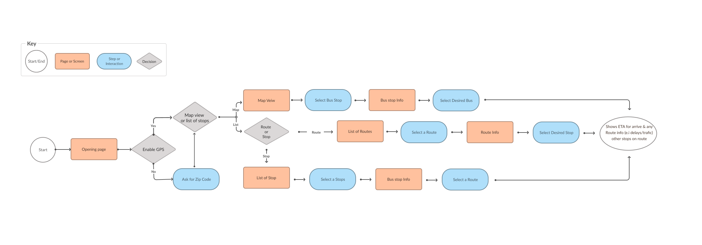
Site Map
After understanding the screens I would design from the user flows, I created a site map to organize my screens and lay out the hierarchical structure of my app.

Low Fidelity Wireframes
After creating user stories, user flows, and a site map, I started sketching out low fidelity wireframes. I used the Four Ups method to jump start my brainstorming process and churn out quick iterations.


I found this really valuable because it helped stretch my creative problem solving capacity to find viable solutions and lead me towards a more refined working solution for the app (below).

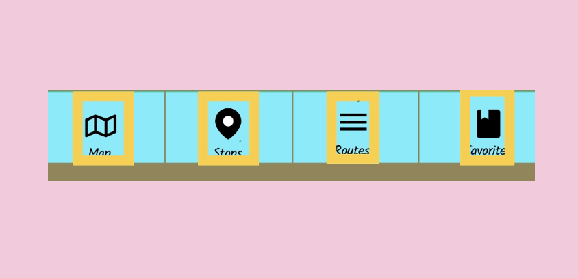
Digital Wireframes
I then created digital wireframes in Figma to begin early stage user testing. Testing was completed in-person on my iPhone using the Figma Mirror app. I walked each tester through a scenario and gave them two tasks to complete.

Click for interactive Prototype
Main Feedback
Wished they had the arrival time listed in stops info screen
Liked the clear and clean interface
Branding & Identity

Branding Story
To create the brand in a fairly simple and efficient way, I did the following exercises:
Create a list of words that I wanted my app to represent and embody
List out as many potential app names that I could come up with, with the criteria being:
Easy to say and write
Immediately clear what the app would be about
Catchy to say out loud
Sketch as many designs as fast as I could without any expectations or judgment
I narrowed it down to two potential names and tried to design for both. I decided to go with “Metro Meter” because it met my criteria of being fun, clear, and easy to say. It was also the easier name to create a logo for.
Logo Design
I designed the Logo by taking the “M” from both words of the name an overlapping them. Making a recognizable and eye catching logo that will work in app and in a menu icon.

Typography
I selected typography that would fulfill two user needs:
It needed to look friendly and modern
It needed to feel professional and instill confidence

The choice needed to communicate “technology, modern, friendly.”
Colors
I applied the same criteria to selecting colors. I wanted something bold and unique, but still tasteful and mature. I also looked at my competitors’ apps to find a color that would be distinct from theirs.
BACKGROUND
#948554

MENU
#C4C4C4

ICONS & TEXT
#000000

LINKS
#69EDFB

Visual Design
High Fidelity Prototype
I applied the branding to the wireframes to create a clickable, high fidelity prototype. After skinning the wireframe, I set up another round of usability testing with three testers.
Main Feedback
a main pain point being that the clickable space of the buttons were too small. So if a user did not exactly click on the icon, their input would not be recorded by the app.
User Testing Feedback
"I would only use the map if I were going somewhere new, but not on a familiar, everyday route."
- Participant 1
"Because it tells me how much time I have to get to the bus stop, I don't feel like I need to go to the map."
- Participant 2
I like that I can see the reasons for a delay, but it was hard to find.
- Participant 3
I also had some questions I wanted answers to as I went into this next round of testing.
Does the user go to the Favorites right away?
Yes
Is the nav bar intuitive?
No
On the “Stops” screen, do users want to see the next arrival time for all line or just their route?
None mentioned it
Final Prototype
With all the feedback I received in my usability tests, I adjusted the design and the final mockup to:
Extend the clickable space to encompass the whole button, to insure that its delivering the user with the desired feedback
To add a “I” information icon to delayed link to make it more recognisable as a clickable component.
To have both scheduled arrival and a current arrival time displayed on the stops info page. To ensure the users are aware the affected of any delays.
Final Usability Testing Feedback
It was also very valuable to receive positive feedback because it helped point me in the right direction and stay on track to eliminate the confusing parts, while retaining the successful parts.

“The app is very simple, but it gives me everything I need.”
- Participant 2

“I like how there are different options. To get to the information I need.”
- Participant 1

“Assuming that the data is accurate, I would highly recommend it. It’s exactly what ppl want.”
- Participant 3


What I Learned
A live map was not a priority.
Users did not prioritize seeing their bus on a live map since they had reliable and accurate information about their arriving bus immediately presented to them
Brainstorm, quickly and frequently.
I learned the importance of brainstorming, quick iteration, and frequent testing at each stage along the way. Even from the very beginning, it’s extremely important to get a rough wireframe in front of another person who can give you feedback. The solution can only be solved in an iterative manner because you understand the users and the product more as you dive further into it.
Document everything!
I also learned the importance of diligent documentation along the way as it provide highly useful and allowed me to pull together the information I needed in writing my case study and also putting this presentation together!